As a Senior Product Designer, I led the redesign of the Credit Card L1 product page for a major financial services company. The existing page had usability friction, lacked clear visual hierarchy, and did not effectively guide users toward key actions. My goal was to create a more intuitive, visually engaging, and high-performing page that improved user comprehension and increased conversions.
Problem
The previous L1 product page faced several challenges:
Lack of Clarity: Users struggled to understand key benefits and details about the card.
Inefficient Information Hierarchy: Essential information, like rewards and fees, was buried.
Low Conversion Rates: The page did not effectively drive users toward application or exploration.
Inconsistent Visual Design: The UI was outdated and did not align with the evolving design system.
Goals
Improve the clarity and scannability of key information.
Optimize page structure to guide users toward application.
Enhance visual craft and align the page with the company’s design system.
Improve accessibility and usability across devices.
Approach
User Research & Insights
To inform the redesign, I conducted:
Data Analysis: Reviewed page performance metrics, drop-off points, and heatmaps.
User Testing: Observed pain points in how users navigated and processed information.
Competitive Analysis: Evaluated best practices from leading financial brands.
Findings
Users wanted a clearer breakdown of rewards, fees, and application criteria.
Visual clutter overwhelmed decision-making.
CTA placement was not optimized for action-driven users.
Solution
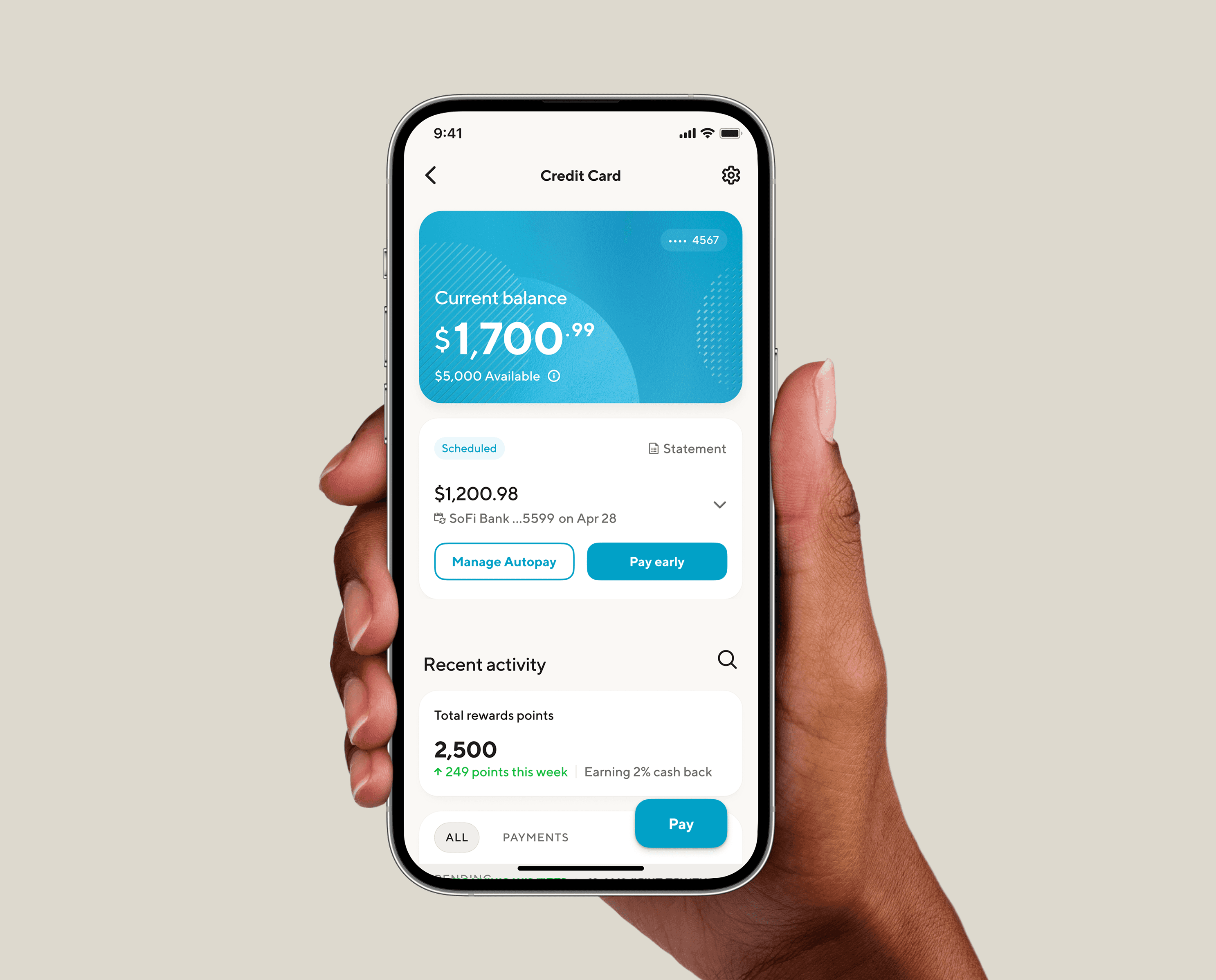
Restructuring Information Hierarchy
Implemented a modular layout prioritizing essential details (e.g., benefits, fees, eligibility).
Created progressive disclosure patterns to reduce cognitive overload while keeping details accessible.
Enhancing Visual Craft
Designed a more refined typographic scale for improved readability.
Applied a bold, structured layout with generous whitespace for clarity.
Introduced iconography and illustrations to help users quickly grasp benefits.
Aligned with the brand’s evolving design system to ensure consistency.
Improving Usability & Accessibility
Ensured WCAG-compliant contrast ratios and text sizes for better readability.
Designed with mobile-first principles, optimizing for small screens.
Added sticky navigation and persistent CTAs for seamless engagement.
Results
Following the launch, the redesigned page saw:
+18% increase in conversion rate (application starts)
+25% improvement in engagement (time spent on key sections)
Significant reduction in drop-off rates in the application funnel
Positive qualitative feedback from user testing and internal stakeholders
Reflection & Learnings
This project reinforced the importance of balancing functional clarity, storytelling, and visual craft to drive both usability and business impact. By leveraging user insights, structured design thinking, and refined aesthetics, we created an experience that not only looked better but also performed better.
Next steps
To continue optimizing the experience, I proposed:
A/B testing variations of the CTA and benefit positioning.
Exploring personalization based on user browsing behavior.
Expanding this framework to other L1 product pages for consistency.